
THE ENERGY OF NATURE: Artist Adriane Stark Tries to 'Get Close to Her Subject' to Reveal 'Its Inherent Beauty and Dynamic Characteristics'
In a world of constant noise—scrolling feeds, relentless headlines, and algorithmic distraction—Adriane Stark's work commands attention with breathtaking clarity. Her photography doesn't just capture moments; it seizes them, energizes them, and invites you into a vibrant conversation with the natural world.
Celebrated for her dynamic botanical images and striking architectural compositions, Stark has developed a visual language that pulses with life and vitality. Her signature style—bold, sculptural, and captivating—offers an invigorating counterpoint to mundane existence. "I'm not creating passive images," she says. "I'm revealing the natural vibrancy that runs through everything around us."
Stark divides her time between the Hamptons, NYC and South Florida, drawing creative energy from each locale. Her profound connection with nature fuels both her artistic vision and personal passion. "I capture the raw power of what I see," she explains. "Not as something static, but as something vibrantly alive. There's an irresistible dynamism to nature—its shape, its light, its rhythm—and I amplify that energy through my lens."
Garden as an Escape
A graduate of Parsons and a former Art Director with an illustrious editorial background, Stark's evolution to fine art photography represents an exciting creative expansion. She collaborated with industry titans—The Museum of Modern Art, Random House, Viacom, and The New York Times—earning prestigious accolades from The Art Directors Club, AIGA, and the James Beard Foundation. Eventually, the digital world's limitations became apparent. "The screen couldn't contain what I needed to express," she says. "I discovered that nothing rivals the dynamic complexity of Mother Nature."
This breakthrough occurred during the pandemic while at her Hamptons residence. Like many, Stark initially planned to master new software and skills during lockdown, but instead found herself drawn to the outdoors. "I stepped into my garden seeking escape," she recalls. "The energy, the movement, the vitality—it was pulsing all around me."
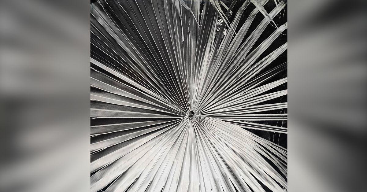
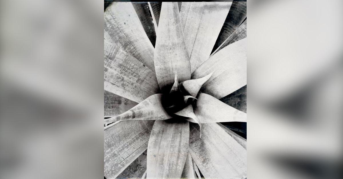
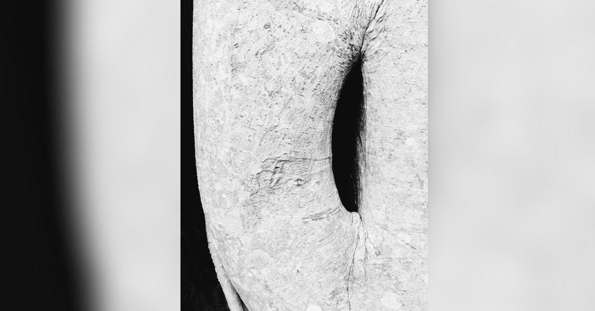
Her portfolio, featuring both dramatic monochromatic works and richly textured color pieces, honors traditional photographic techniques while feeling thoroughly contemporary and dynamic. "They're not simply black and white," she explains. "They're four-color black and whites—a technical approach that allows me to create extraordinary depth and dimension, not just contrast."
Authentically Alive
Each image bursts with intention and energy—almost vibrational. Her celebrated floral series, especially the white flower studies, draws inspiration from groundbreaking landscape designers like Vita Sackville-West and Russell Page, who championed immersive engagement with nature. "Page taught the importance of walking your garden every day, and that's exactly what I do," Stark reveals. "I'm inspired by observing the daily transformations. It's like a story that unfolds day by day—each morning brings new characters, new drama, new revelations."
This powerful approach to capturing nature's vibrant moments has brought her work to prestigious institutions including the Cooper Hewitt, the Smithsonian, and recently, the Palm Beach Photographic Center. Despite these achievements, Stark remains focused on her core mission: igniting connections—not just between viewer and image, but between people and the revitalizing natural world.
"We weren't designed for a passive screen existence," she asserts. "We were made to engage, to breathe deeply, to immerse ourselves outdoors. Reconnecting with nature feeds our minds, bodies, and souls, enhancing our quality of life in profound ways. The clean air, the soothing sound of ocean waves, the abundant beauty in gardens and landscapes—all of these connect us to something essential, offering serenity and peace in our hurried lives. My work aims to spark that realization—to inspire people to cultivate their own gardens, regardless of size, to feel the exhilarating curve of a leaf, to experience something authentically alive."
Inspired by the Greats: O'Keeffe & Avedon
She draws inspiration from visionary icons like Richard Avedon and Georgia O'Keeffe, particularly admiring O'Keeffe's transformative perspective on Southwestern landscapes and Avedon's bold decision to transition from fashion to photographing everyday Americans. "O'Keeffe wanted her friends to see and be moved by the natural landscape as she saw it," Stark reflects. "And Avedon didn't just document people—he elevated them to reveal their power and essence. That's my approach with nature—I expose the dynamic energy surrounding us that most people overlook."
Echoing the philosophy of legendary photographer Robert Capa, who famously said, "If your pictures aren't good enough, you're not close enough," Stark explains: "I try to get as close to my subject as I can to reveal its inherent beauty and dynamic characteristics. That intimacy creates power."
Stark personally prints most of her work, often manipulating tones and textures to create pieces with distinctive, almost tactile qualities. "Like fingerprints," she says. "Each one pulses with its own unique energy."
Her ultimate goal isn't technical perfection—it's igniting engagement. "When someone experiences my work and thinks, 'I need to bring that natural energy into my life,' then I've succeeded."
Because ultimately, Stark's images aren't just about flowers or architecture or landscapes. They're about the vibrant life force that enriches our world. The resonant pulse between moments. The dynamic reminder that the world doesn't just exist—it thrives, it flourishes, it dazzles—if we're bold enough to engage with it.